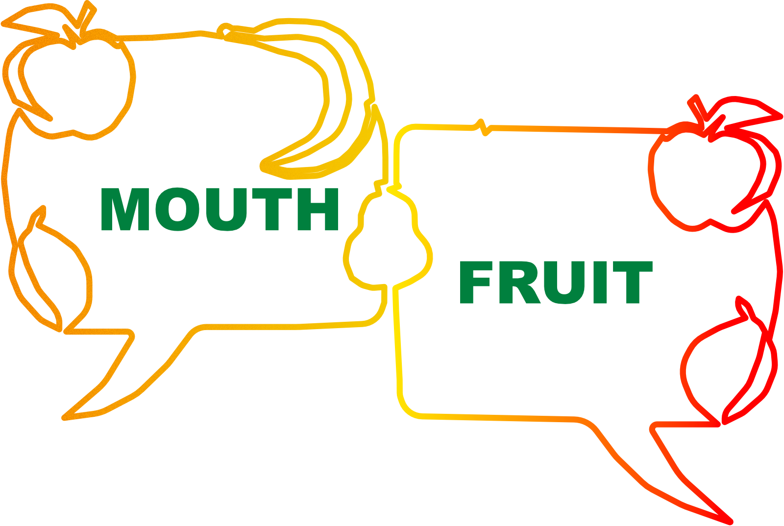
The Pie is a Lie: ➋ Pie Charts
In the second post in the pie series, we move to those "quantitative" pie charts.

Many people around the world understand the notion of pie.
However, there is something that is used around the world that is understood by more people. It is usually covered in competency testing for using International English. Most who are ready to communicate know it. That is the pie chart.
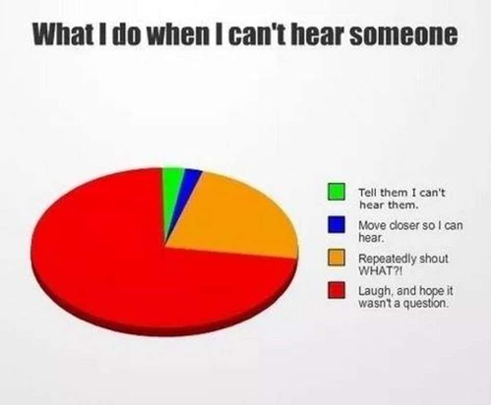
Here is a funny (and flawed) pie chart.
The pie chart visualization became popular in the early 19th century. Credit is given to William Playfair for inventing it in 1801, but the popularity of good circular infographics increased with "coxcomb" diagrams created by Florence Nightingale—polar area diagrams. These clearly showed that more soldiers died from untreated illnesses than from battle injuries. The polar area diagram expands the use of the pie chart which fell short of what Nightingale wanted to communicate. (I suspect that Nightingale may have been more inspired by the wind rose, than by Playfair's illustration, but I understand that she studied such graphical communication so that influence would be there somewhat.)

There was a very slow growth of pie chart usage from it being included in William Playfair's Statistical Breviary until the early 1980s when we every day folks had Lotus 123 and Excel available. At that point—when we mortals could use computers to communicate visually using graphics that were pretty and accessible—pie chart usage started rising steadily. This continued until the infographics revolution of about 2010. There was an abrupt plateau. The thinking that visualization must be beautiful became accompanied by overwhelming needs for truth, for fidelity and for reception.
Don't call them pie graphs or circle charts. I learned this eventually. The in crowd calls them, ahem, pie charts. You don't want to sound like a noob right? On the other hand, we are all noobs, and can be patient and accept lots of names. (Then, again, maybe some people mean something else by "circle charts"; I don't know.) Be safe: "Pie Charts"
A = (½ r²) θ
A mathematician might say that the ratio between the area and the angle is fixed. So, one cool thing about pie charts is that the area of a slice goes up the same as the angle. Double the angle and you double the area. Do you see the slice as an angle? When thinking of the apple pie and do you see it as the amount of pie you get? Either or both is fine. However you perceive a pie slice, and thus the pie chart slice, perception of the portion works. Usually. Watch for visual tricks.

Pie charts can be flawed
Pie charts have rules in a sense. There are times when a pie graph is flawed or does not communicate the information fairly.

Categorical pie charts
The cleanest pie charts are categorical pie charts. A dataset is broken into several subsets by a sorting function. Throw an item in the dataset into the sorting-function machine and out comes a colored tag. Or, better yet, pour the dataset bucket into the sorter and let the machine drop each element into its jar. These are also called frequency count pie charts.

What can go wrong?
- Too many categories
- Similar-sized categories
- Other and Unknown categories
- Ordering confusion
- Use of categories that are not mutually exclusive (see MECE, below)
- The whole is not meaningful
- Insightful change is lost
MECE (pronounced ME-see) stands for Mutually Exclusive, Collectively Exhaustive. It is a principle for organizing information into categories that don't overlap and don't leave gaps.
The term comes from McKinsey & Company (a management consulting firm) where it's a core principle of their problem-solving approach. Barbara Minto, who developed the principle at that firm in the late 1960s, pronounced MECE as rhyming with "niece", which seems fair, she came up with it. Minto felt the basis had foundations in metaphysics (as many good ideas do). She said that we tend to start talking about our ideas before we even understand our ideas.
Other diagrams also lend themselves to MECE as seen in tree-logic diagrams at Lindsay Angelo's MECE Guide (poor examples in my mind) and Venn diagrams at RocketBlocks.
However, MECE has structural features that encourage zero-sum framing, even though the principle itself could be applied to non-zero-sum situations. The visual illustrations have a cognitive bias.
MECE visualizations, especially pie charts, create zero-sum thinking these ways:
- Fixed Boundary. We define the whole up front.
- Mutual Exclusivity. We look at one path or the other, not both.
- 100%. If you get more, do I get less?
- Hidden Value Creation.
- Subliminal Messages. We receive messages such as "The other department is stealing your part of the budget."
- Stopped Clock.
It boils down to a cognitive bias: How do I divide X? How do I use this hammer to solve the problem? Look at this snapshot. We don't talk about the sum anymore.
So, even pie charts with a solid MECE basis can send a message that binds us.
Weighted sum pie charts
These are also valid. You can call them aggregations by attribute or share analysis. The weighted sum pie charts show the total value in each category such as revenue or time spent.
Personal estimation pie charts
Sometimes a pie chart shows one person's estimation. Let's see how far we can stretch this.

At a gathering, boys and girls exchanged chocolates. Some observations were made and the results were put into pie charts.
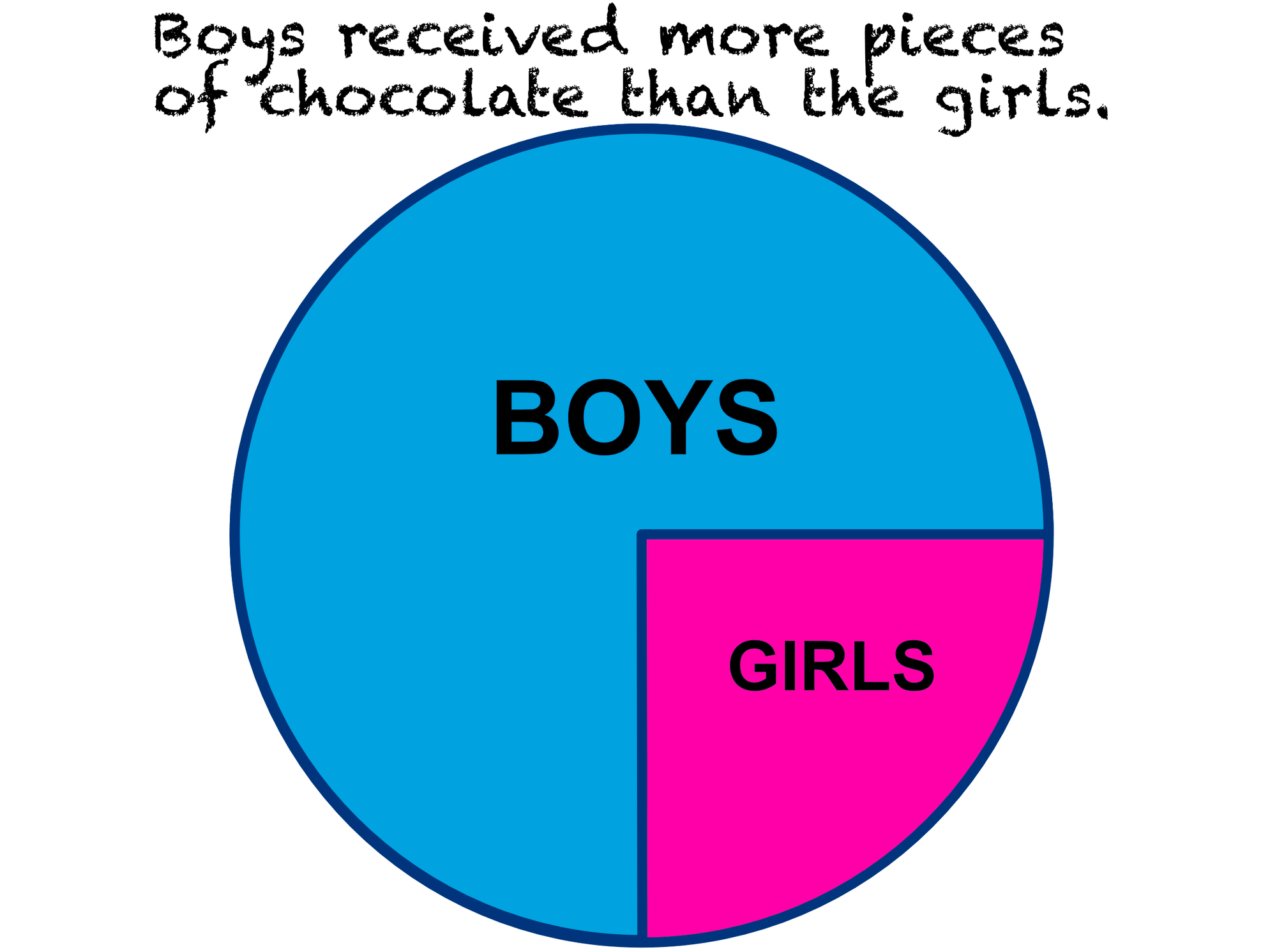
Maybe an observer counted the chocolate gifts as they were handed out. Or guessed. Another observer might see things differently, perhaps getting a sense of the amount of chocolate.
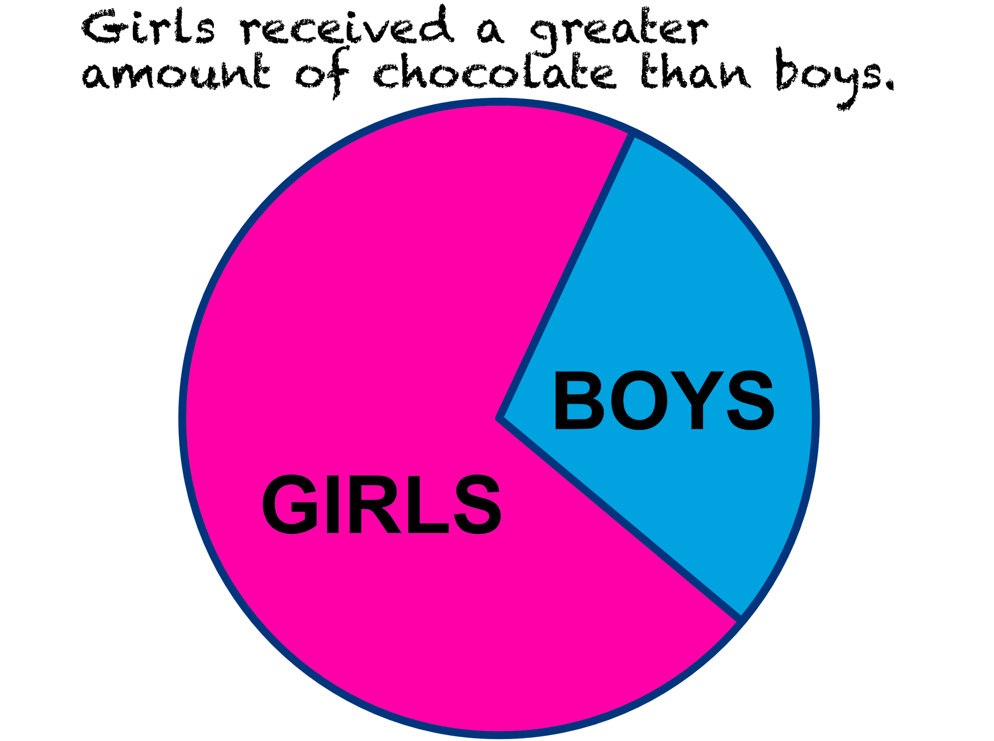
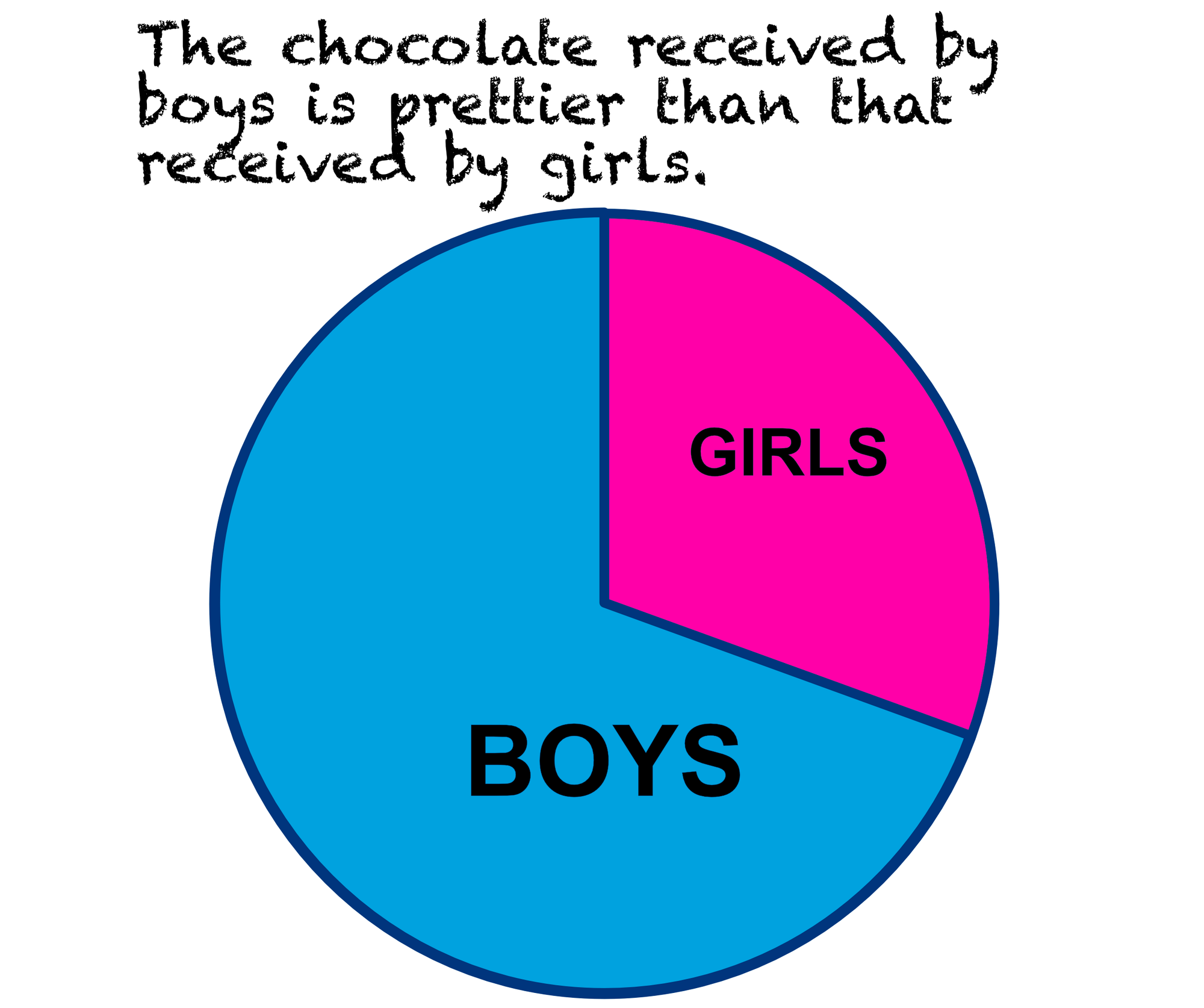
Another might have looked at a different attribute, perhaps more subjective.
But that is all about the chocolate. How did the exchange impact the overall happiness of the gathering? The people are what is important. Here is a try, but it attempts to show something that cannot even be measured.
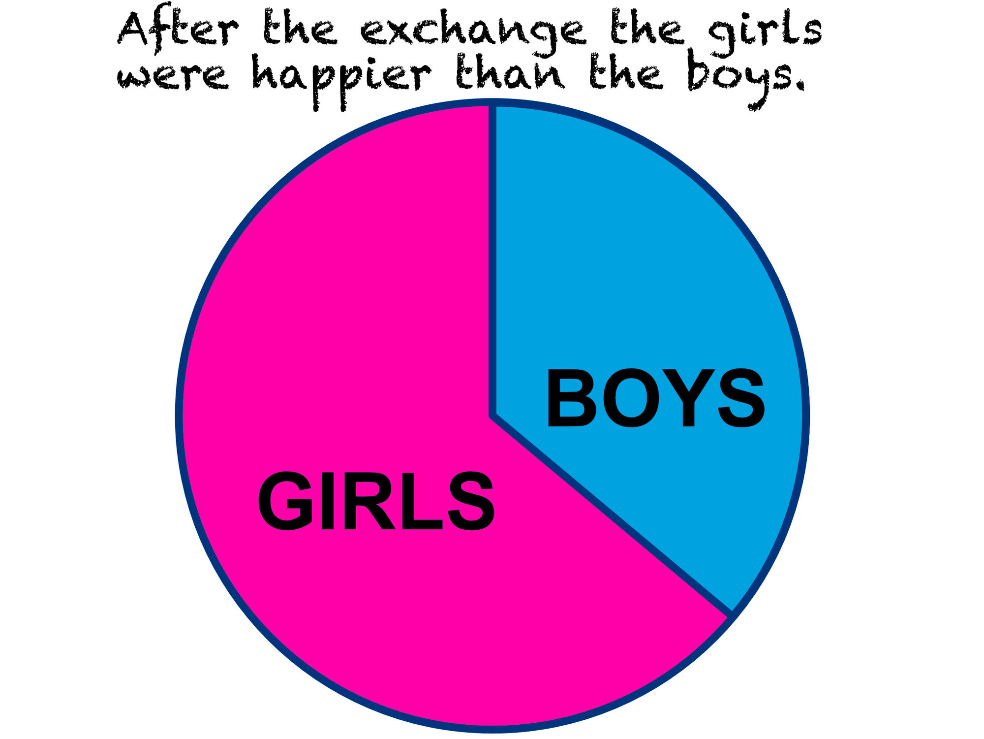
By the use of the graphic, it seems we are saying that the girls were twice as happy as the boys right at the snapshot after the exchange.
Because we really cannot measure the happiness of people, this pie chart is a lie.
Can this be fixed? Maybe, smiles can be counted. Maybe, there can be a scoring of smiles. Applying a questionnaire at this gathering will significantly impact the score. So, yes, we can get some idea, but we really don't know.
As microeconomics shows, interpersonal comparisons using utils—the hypothetical unit of utility—are meaningless. You cannot say, 'Hey, buddy, let me buy lunch; you received only 40 utils this morning and I got 2088.' Well, that might be fun to say, depending on the relationship, but those values are not comparable across people. Modern economics has largely abandoned cardinal utility measurement in favor of ordinal rankings.

We will see more of what microeconomics says about how the pie is a lie, later.
Using pie charts for beauty, enjoyment, or even a greater richness reveals the epistemological violence of forcing qualitative experience onto quantitative visualization.
The pie chart can say to us that some things can be quantified when that is a lie.
When we assume that dialogue and conversation are zero-sum games, we miss something very important. (Yeah, I know, what is a zero-sum game?)
Ratios
We see it in our feelings about latticed crust apple pie. With warm filling. Oh, yum. And it also shows up in what pie charts say to us. Sometimes the percentage of the whole is important. But usually it is the total amount of each portion that is important.
Consider one boy and one girl in the above gathering. They gave each other chocolate. Each decided to give chocolate. Perhaps each would say they are happier now that they did.
Suppose marketing gives you a pie chart showing the market share of your cool product line. You think, "Oh, we need to improve our market share." You are blocked from thinking, "We are in a unique position to increase the market."
The pie and the clock
The description of pie charts at Atlassian shows a good example of why pie charts fail at showing time, even before and after an event. What to do? Hint: Grouped bar chart.
Pie Charts can work
When some totals are relatively fixed, such as the surface area of Mars, a pie chart can make good sense.
Building on this
From the feelings we have about apple pie to the bias in the pie chart presentation, you might have comments or questions. Even a challenge.
Do you know some funny pie charts? Stay away from current public debate, of course.
This is leading us to microeconomics and zero-sum game theory. Are you ready to move on to that? Or did you come from those posts?
The next time you see a pie chart consider this. Does this have hidden messages (intended or not) that the total is fixed? Is there an assumption of envy or competition?